CDK Global: Remote Test Drive Booking App
MY ROLE
Research
UI/UX Design
User Testing
Interaction Design
Animation
UI/UX Design
User Testing
Interaction Design
Animation
CONTEXT
2 weeks
Internship
Hackathon Project
Internship
Hackathon Project
OVERVIEW
During my summer at CDK Global, I organized the 4 other design interns to form a design-only hackathon team, where we designed a remote test drive booking experience in response to the COVID-19 pandemic and existing pain points in the car purchasing process.
QUESTIONS
We brainstormed some initial questions to get a better grasp on the problems at hand.
“What are some existing problems in the auto industry?
“Who is purchasing cars during the pandemic and where?
“How can we build a tool to address the COVID-19 Pandemic?
“What are some pain points in the car buying process?”
“Who is purchasing cars during the pandemic and where?
“How can we build a tool to address the COVID-19 Pandemic?
“What are some pain points in the car buying process?”

FOCUS
Based on internal company studies, we discovered two main things:
1. Test driving the car is one of the main customer needs before purchase. However, the pandemic made test driving much more difficult.
2. Customers do not enjoy the in-person car purchasing process, and companies were shifting to streamlined online car purchasing experiences even before the pandemic.
2. Customers do not enjoy the in-person car purchasing process, and companies were shifting to streamlined online car purchasing experiences even before the pandemic.
RESEARCH
We decided to build a solution to the temporary issue of in-person test driving that also served as a proof of concept for an entirely digital experience of purchasing a car.
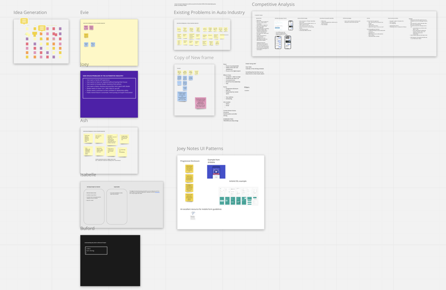
A small snapshot of the collaborative Miro board we used to compile research.
PERSONAS
We synthesized 5 personas from the research we conducted to understand the needs of car buyers better.
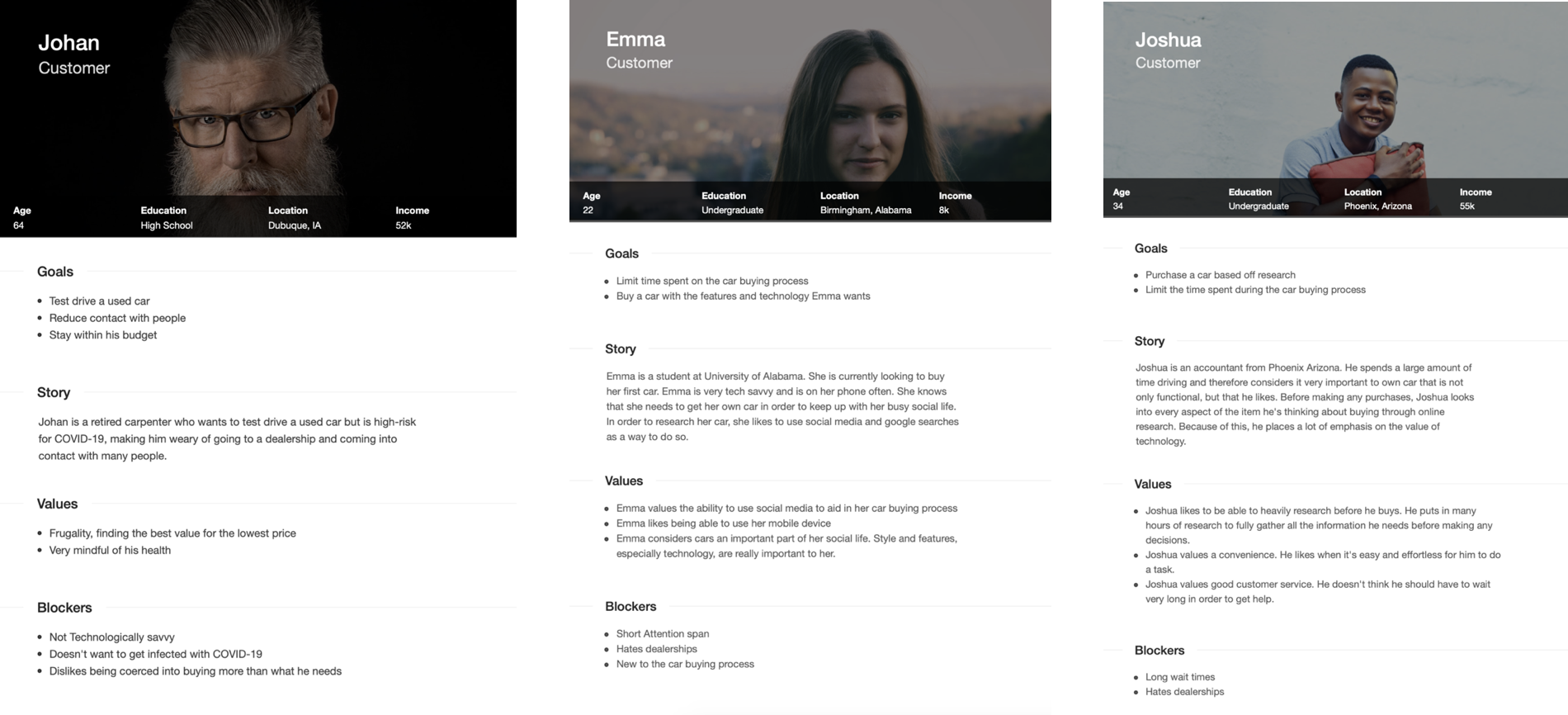
Several of the personas we created to help create a suitable solution.
IDEATION
From an ideation session grounded in our research, we decided to create a progressive web application focusing on natural language, micro-interactions, and clear information communication.
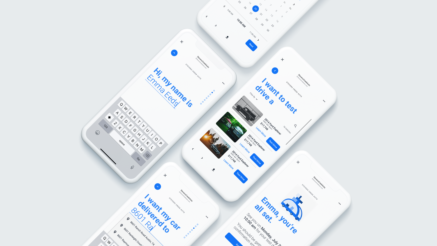
PROTOTYPES
We translated our lo-fi wireframes into mid-fidelity screens using the company's new design system. This design system had not yet been used for a mobile application, so we designed micro-interactions and UI Patterns that would aid the Radial Design System in translating to mobile.
PROTOTYPES
With a simple Invision prototype, we conducted 4 usability tests and received some valuable input:
We did not provide the user with enough information why they were going through certain steps
We backloaded too much information gathering beyond the existing flow without making the expectations clear
The bright blue of the background was rather jarring
We backloaded too much information gathering beyond the existing flow without making the expectations clear
The bright blue of the background was rather jarring
VALIDATION
We also received validation for our idea:
“I like how it was very simple, there’s not a lot of text and it’s exactly what I needed to know and do”
“I’m surprised how straightforward that was, I think this would be useful”
“I like that better than going to the dealership, actually”
“I’m surprised how straightforward that was, I think this would be useful”
“I like that better than going to the dealership, actually”
GOALS
Provide the user with more clear information.
Move backloaded steps such as asking for a Driver’s License and Car Insurance to the beginning of the flow.
Pick a more neutral background color while still sticking to the design system.
Move backloaded steps such as asking for a Driver’s License and Car Insurance to the beginning of the flow.
Pick a more neutral background color while still sticking to the design system.
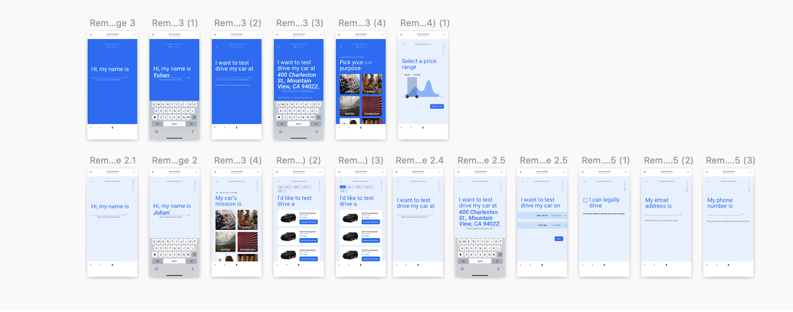
HIGH FIDELITY PROTOTYPE
REFLECTION
Though we didn't win the hackathon, our project is now being considered for actual implementation in CDK's vast line of products. We also received feedback from peers that they were glad to see a project that used the design system to center user enjoyment, and that they hoped it would help shift the company's design culture to a perspective that’s a bit more playful.
It was interesting to realize what unanticipated roadblocks we ran into. The largest tackling point was balancing the ease of use for the user while ensuring that there was not too much unreliability for the dealership. If this project were to continue, we would conduct further usability testing to see how much friction would be healthy to ensure commitment on the user end.
It was interesting to realize what unanticipated roadblocks we ran into. The largest tackling point was balancing the ease of use for the user while ensuring that there was not too much unreliability for the dealership. If this project were to continue, we would conduct further usability testing to see how much friction would be healthy to ensure commitment on the user end.